
Boardy
The best flight tracking app now has a gorgeous new alternate icon harkening to the Golden Age of Travel. Introducing Boardy!
I'm ecstatic to share that I had the privilege of designing an icon for Flighty as part of their recent V2.9 release. I learned so much during the process, & wanted to share the behind-the-scenes of making this icon a reality.
Two Cents on Flighty
First, for those in and out of the know, Flighty is, in my opinion, the premier flight tracking app available. It not only catalogues your flight history, it also notifies you of delays, gate changes, aircraft data, and arrival information. But perhaps Flighty's most initiative feature is their 25-hour flight tracker, which allows you to see the recent history of your aircraft. You can see when the plane is en route to its destination and get an arrival forecast about how that flight has performed (early, on time, late) over the past 60 days.
As far as modern apps go, Flighty might not feel cheap. It's $6/month (about the cost of a bag of chips or coffee at the airport), $49 a year, or $249 for a lifetime. The modern app store has regrettably conditioned many into thinking many digital goods should be free, but for software of this quality and calibre, Flighty can quickly become a worthwhile investment. Not only can I track the flights of family and friends, but when I travel, Flighty has consistently been the fastest app for alerting me of travel delays or gate changes, constantly beating out the airline to notify me days to hours in advance. Time and time again, this has cemented Flighty as an indispensable part of my travel, its value vastly exceeding the cost I initially paid (I bought a lifetime subscription in early 2020).
Also, it's drop-dead gorgeous. It has the best utilization of the Dynamic Island, it's fast, it's intuitive to navigate, and for plane lovers, it beautifully catalogues statistics about your flying history across the years to make it a precious logbook of your travels (for instance, I have travelled 105,000 km (or 2.6 times around the world) since 2011.
Lessons Learned

Famous last words: "how hard can this really be?!"
Developing an icon for Flighty began in mid-December when I teased an image of my progress on Twitter. The inspiration for the app icon comes from the boards seen at airports announcing flight arrival and departure information, and I wanted to create an icon that embraced this motif and harkened back to the pre-iOS 7 days of more dimensional app icons. The intended design had the Flighty placed on the two pieces of the Flip Board, with detailed metal rotators on the left and right, all surrounded by a brushed metal border.
The icon was only ever intended to be a passion project, but when I reached out to the developers of Flighty and shared it, they loved it so much that they invited me to submit it for their next major release. They sent along Gavin Nelson's updated plane image as the starting point, and I got to work creating the rest.
The process taught me a lot, and here are four lessons that stood out along the way.
Lesson 1: Ask
For a week or so before I showed the icon to the team at Flighty, I questioned even sharing it at all. I thought: "They probably have better things to do than look at fan art from some coffee cup Twitter account." And maybe they did, but it doesn't cost anything to ask. I had already put the work upfront, so I had nothing to lose by sharing it. This doesn't mean you should relentlessly harass your friendly neighbourhood app developer, but so often, we are the ones who limit ourselves before we are rejected by anyone else.
Lesson 2: The Devil is in the Details
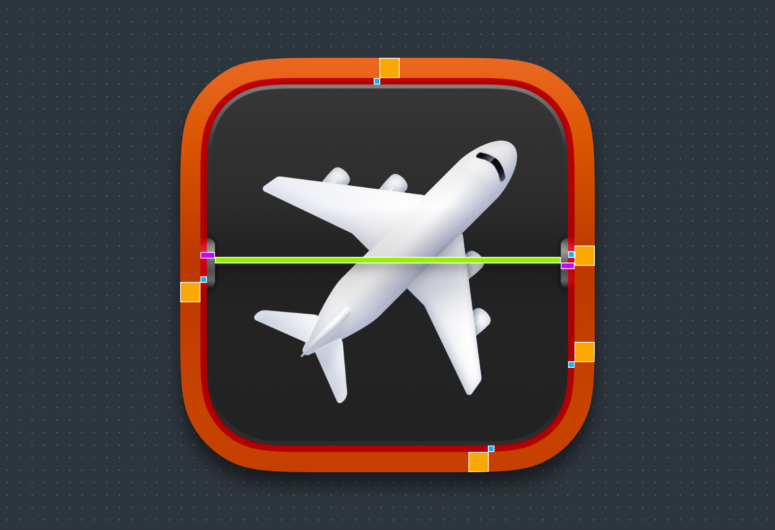
Gradients, shading, corner radii, shadowing, light sources, borders, spacing, masks, etc. There were a million things to consider during the design process of Boardy.
The second thing I learned creating this icon is how much time & work goes into a project like this. The rough idea can take a few hours, but refining, adjusting, tweaking, and editing on repeat stretches the process from hours to days of work. Getting to 80% is relatively easy; perfecting from there requires grit (and lots of coffee).
For Boardy, this meant constantly tweaking shadows, gradients, corner radii, lighting, and noise. All in all, I sent the team some 30 different variations of this icon to critique and review. They all looked good, but repeatedly refining the icon turned a good icon into a great one.
Lesson 3: Accept Help

Pictured above were some of the progress shots of Boardy through to the final release. Tweaks, experimentation, and adjustments were a constant back-and-forth dialogue with the team.
I hate asking for help. People always say to do it, but I hate doing it. And for Boardy, there were moments when I became frustrated with a suggestion or critique made about improving the icon. I hated that I couldn't nail the design, and I hated that I couldn't figure out how. I took a lot of pride in figuring this out on my own and was scared reaching out would water down the work I put into it.
But I was fortunate that the team at Flighty gave me a ton of feedback and also connected me with Gavin Nelson. Gavin has an incredible eye and was immensely helpful in eyeballing each part of the icon to offer feedback & answer questions that enabled me to make it over some of the impasses I had with the icon. It's his plane that serves as the foundation for this icon. I also appreciated that during the process, I was taught how to make these changes myself, which helped me keep some of the autonomy in the design I feared losing.
Ultimately, the feedback gave me a new perspective and elevated my knowledge about techniques to produce the desired effect. I still felt like an idiot, but feeling incompetent is the price to wager to get better.
Lesson 4: Struggle (a Bit)
Growth begins at the point when you are made to struggle successfully. That means challenging yourself to do things that feel hard and that you don't quite pull off each time. Working at that edge takes time, and it's exhausting. Breaks were key. Whenever I felt at my wit's end, I would return to the project after a day and feel a new clarity about tackling something I had been unsuccessful with. Toil, break, grow, repeat.
In Sum
The finished icon is included as part of Flighty Version 2.9
I am so proud to have this little icon featured in an app I value. And the process of designing Boardy has given me perspective on what goes into something as seemingly minor as a single icon. Lastly, my thanks to Ryan Jones, Markus Aarstad, and Francesc Bruguera at Flighty for allowing this icon to be part of their project and for their support and patience; and Gavin Nelson for the encouragement and advice along the way.