macOS Golden Gate Icon Comparison
Comparing the macOS System Icons between Tahoe & Golden Gate (beta 1).
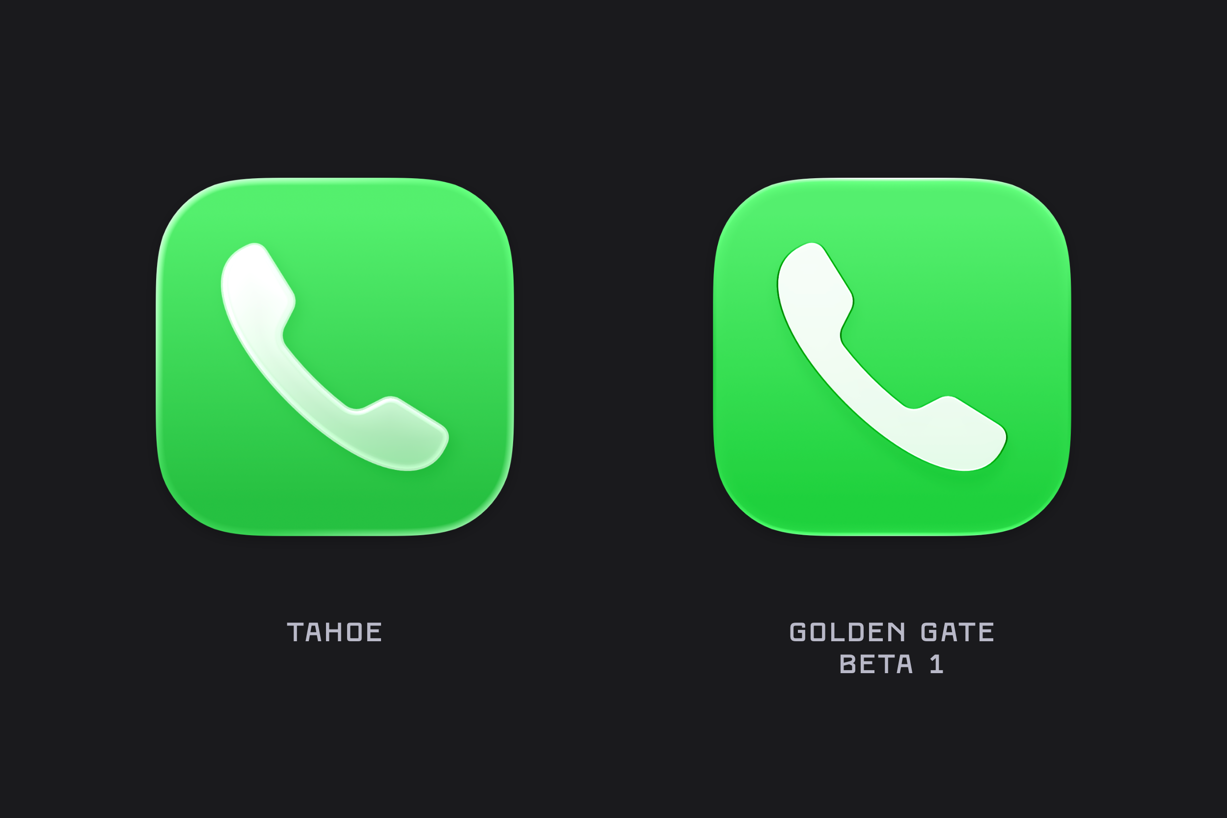
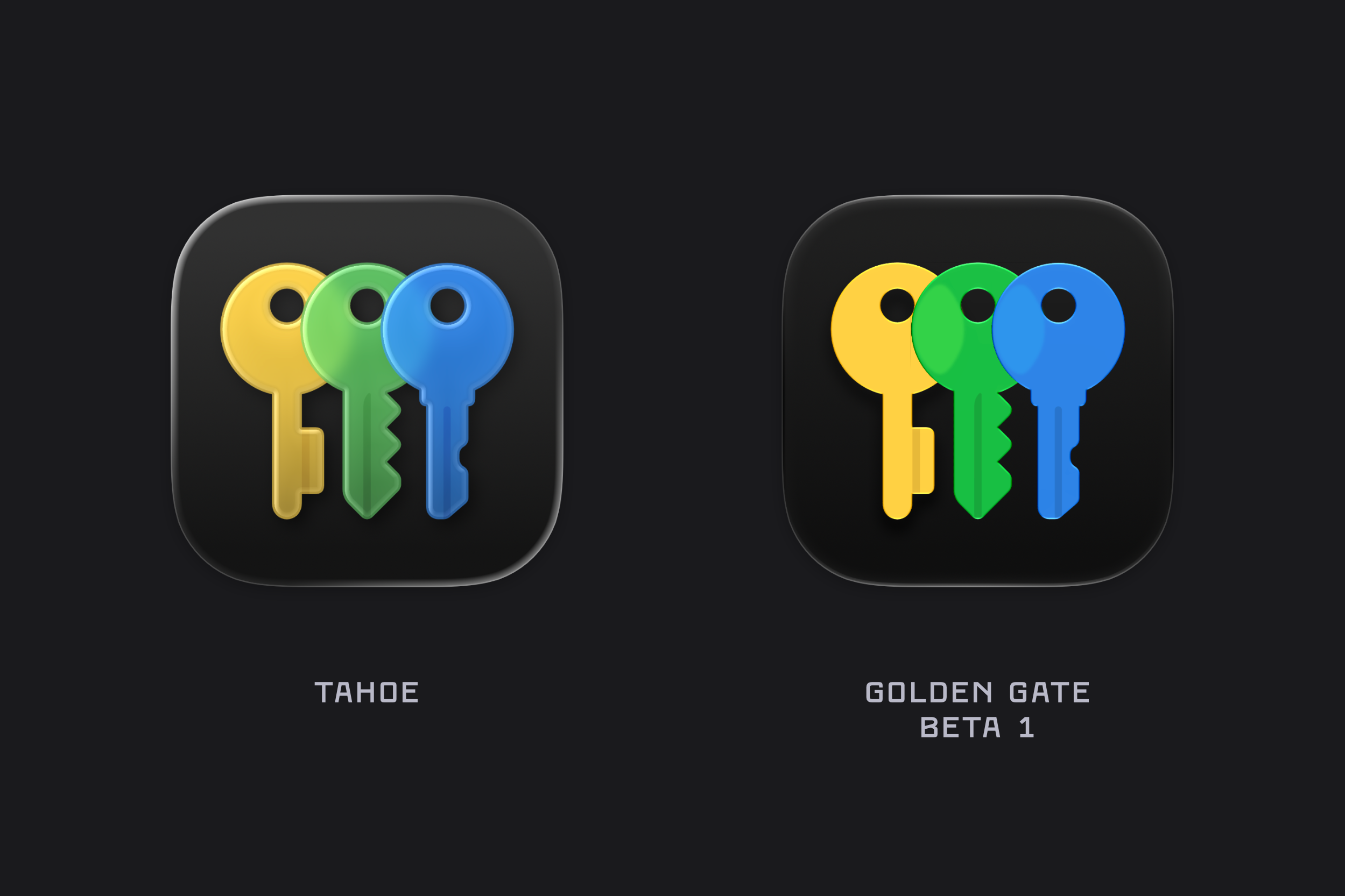
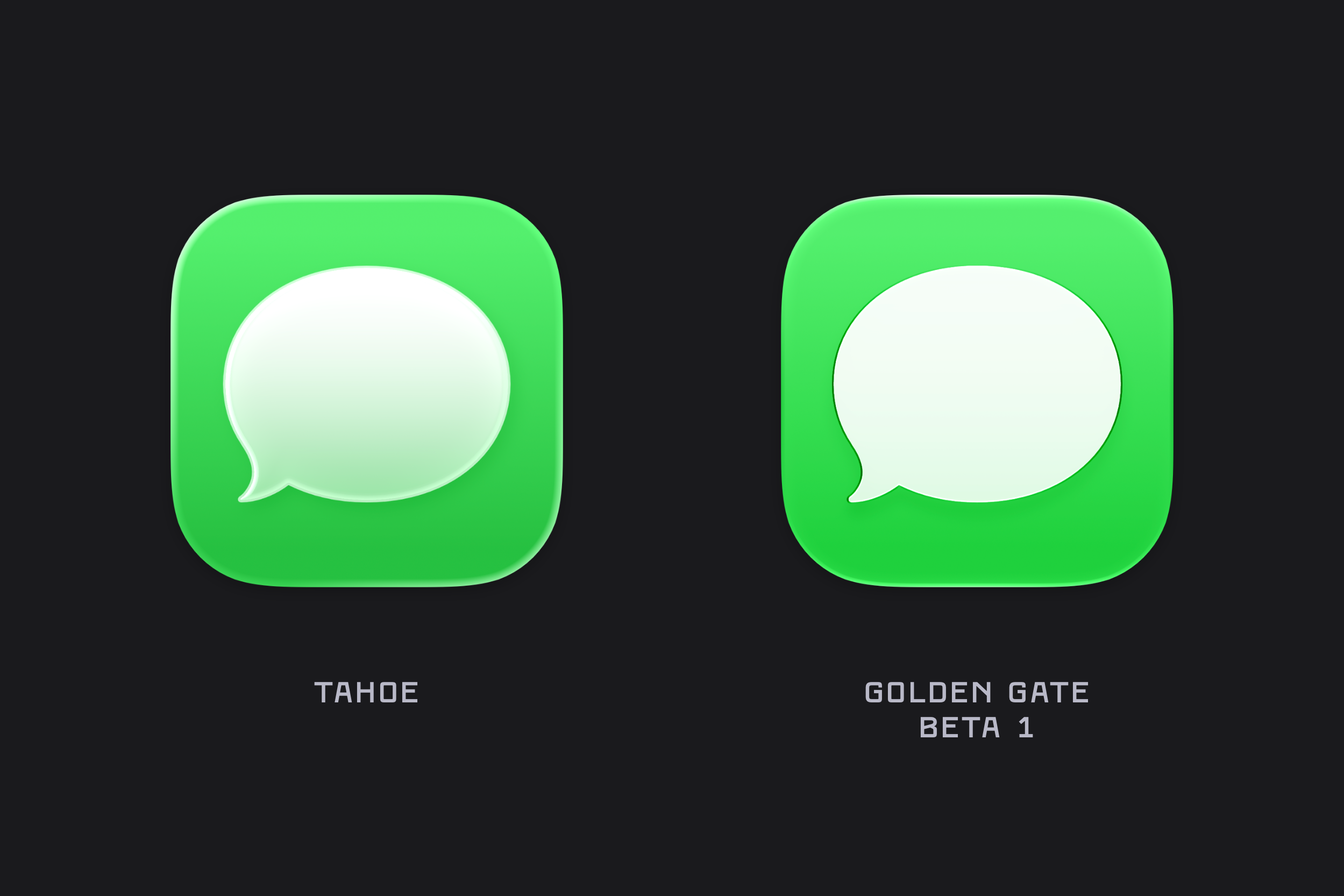
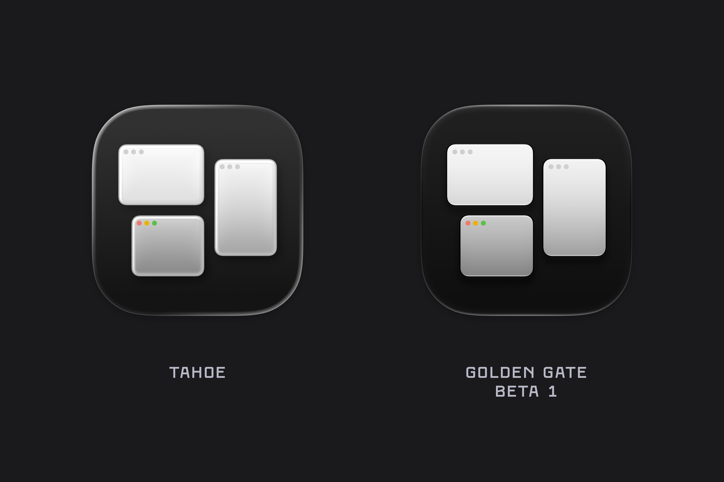
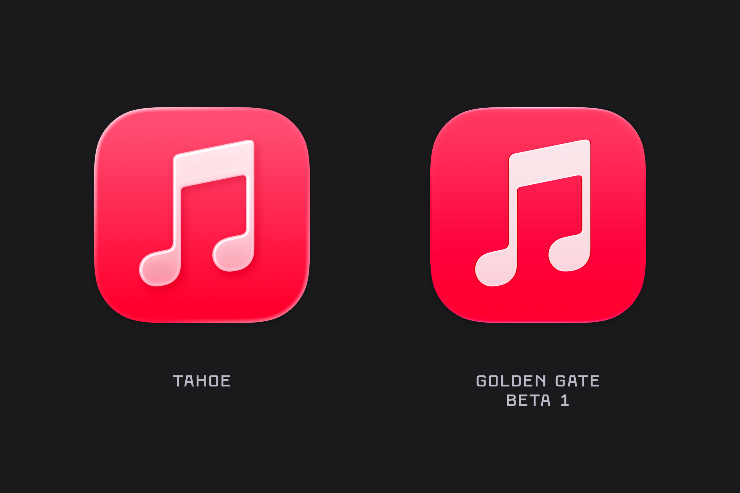
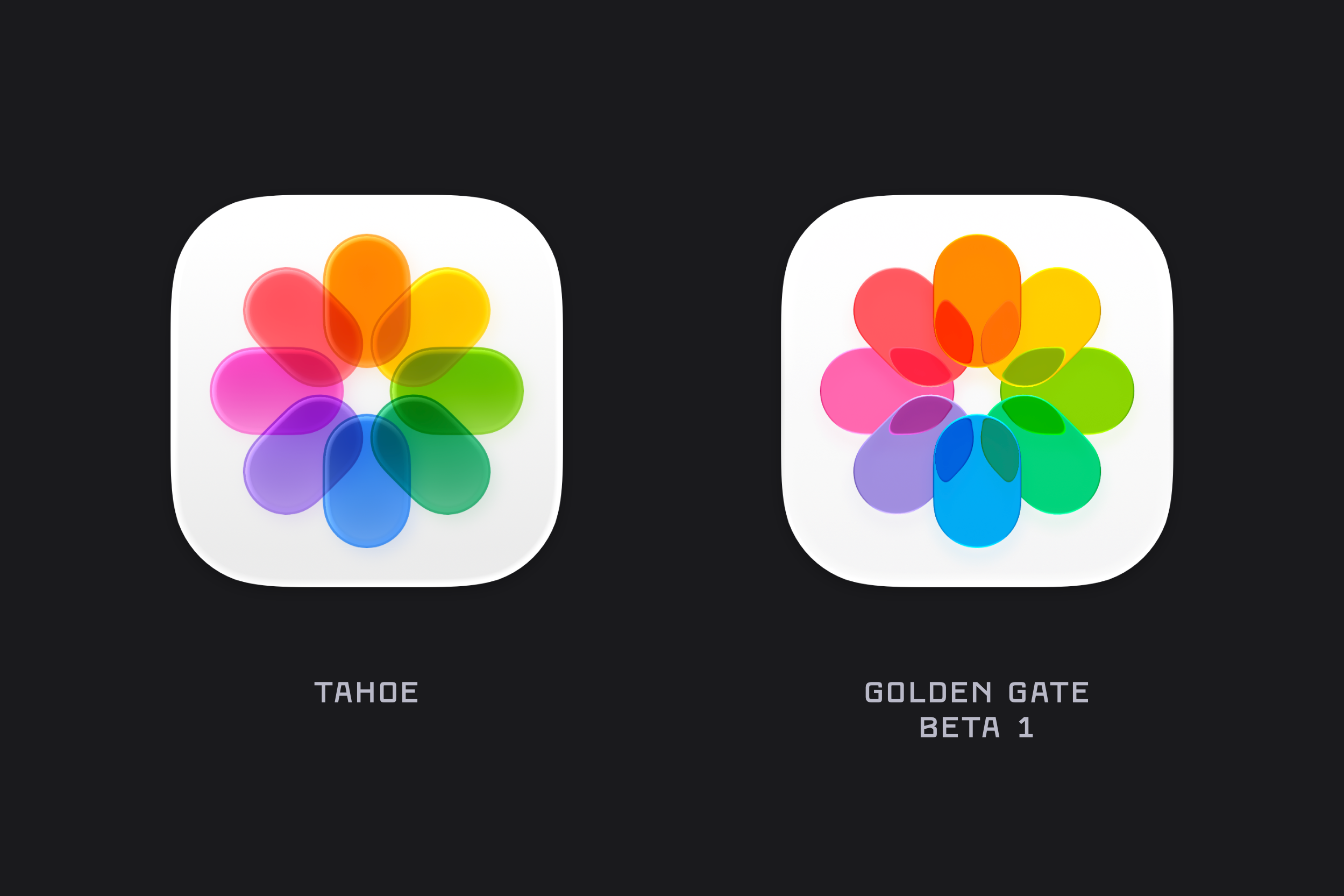
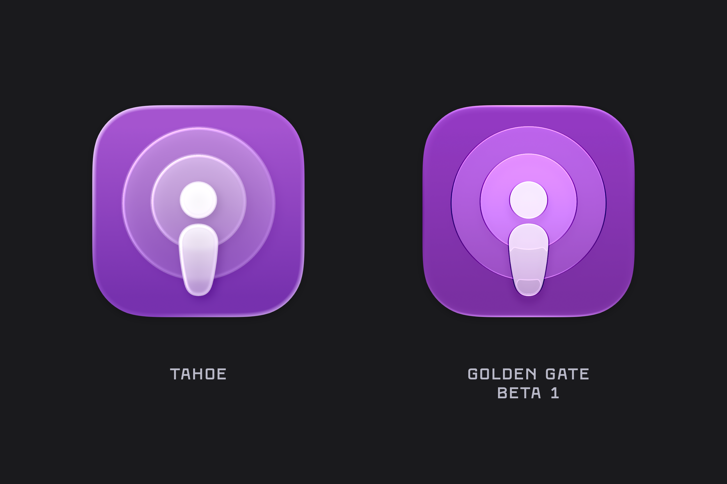
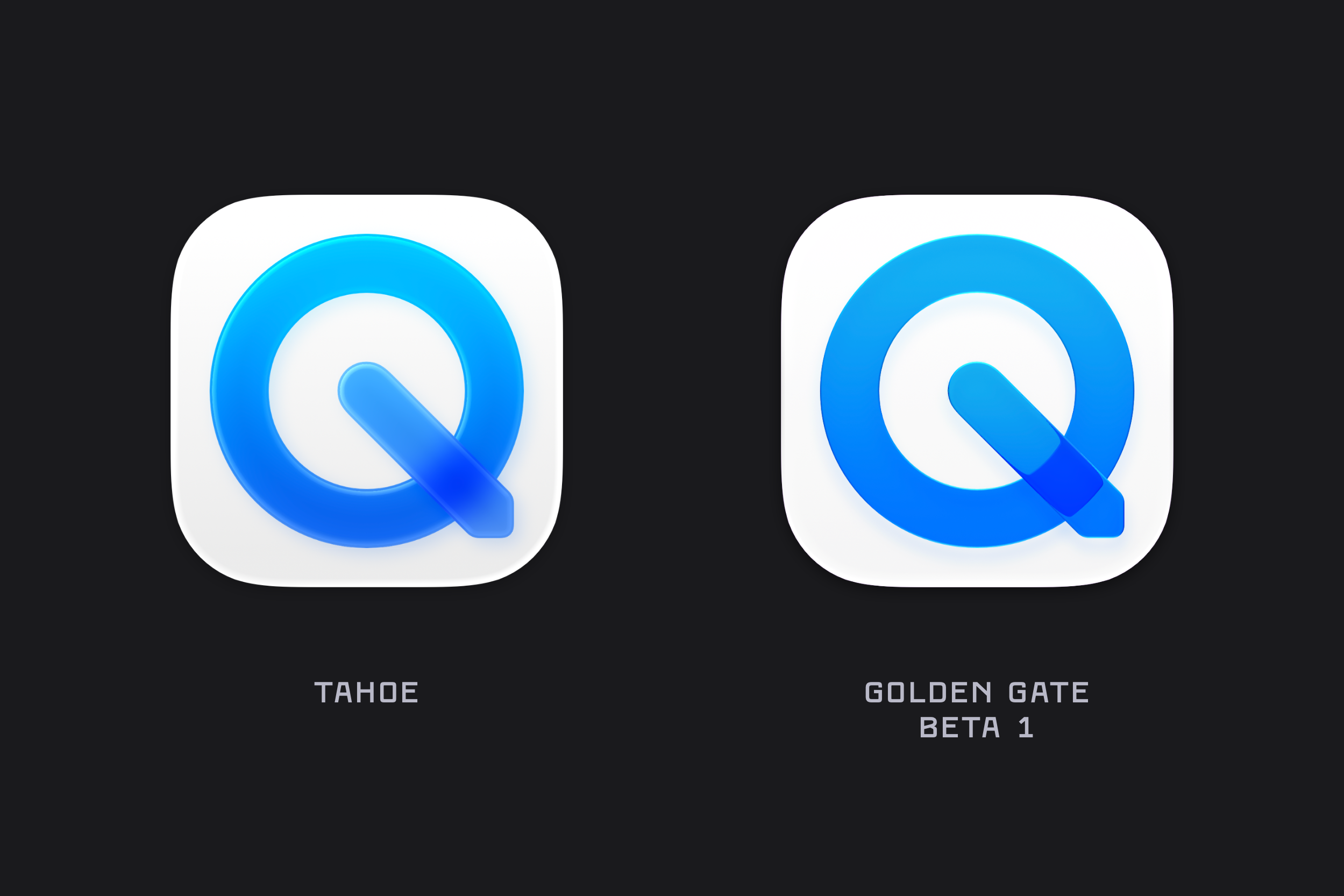
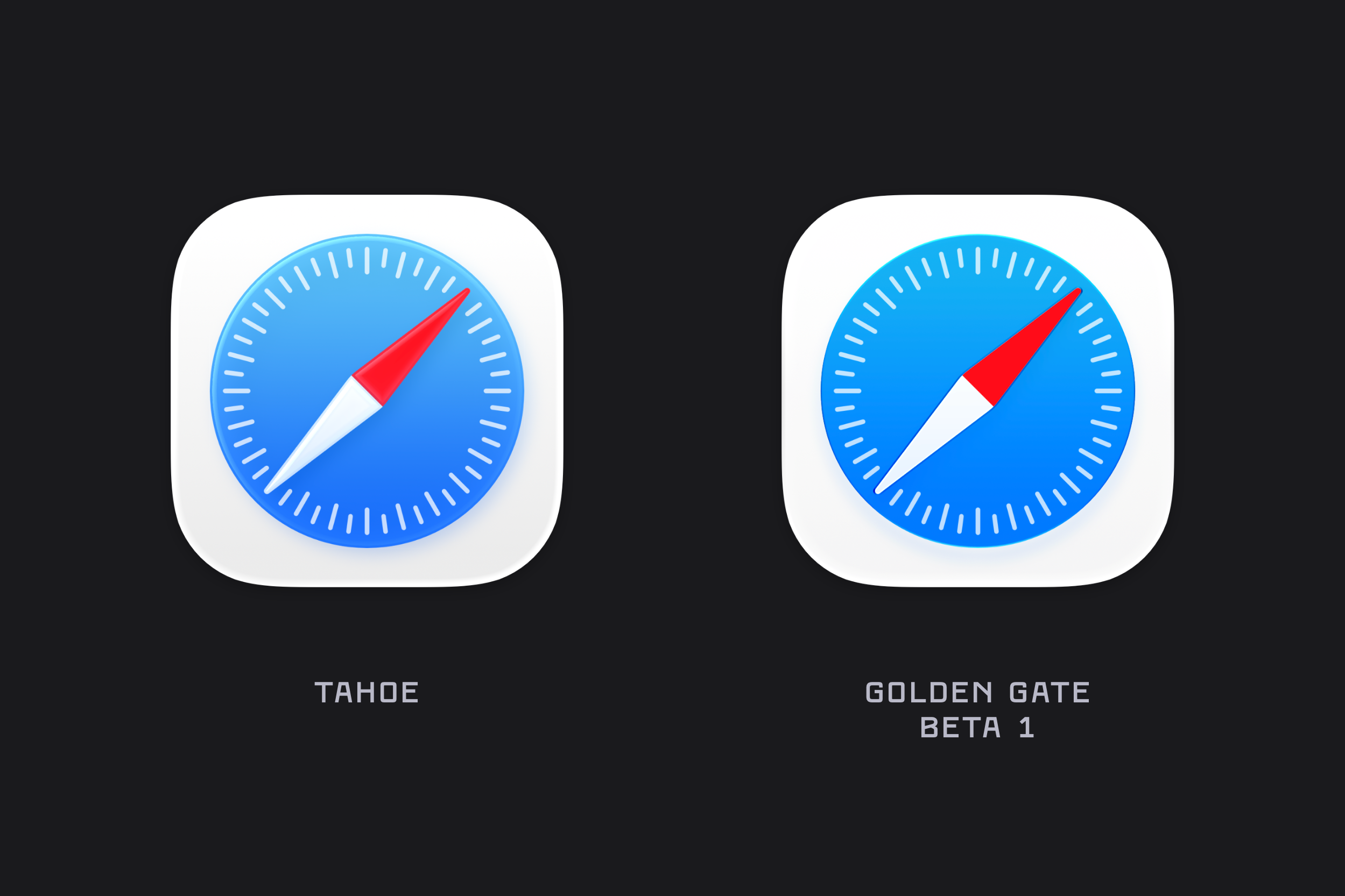
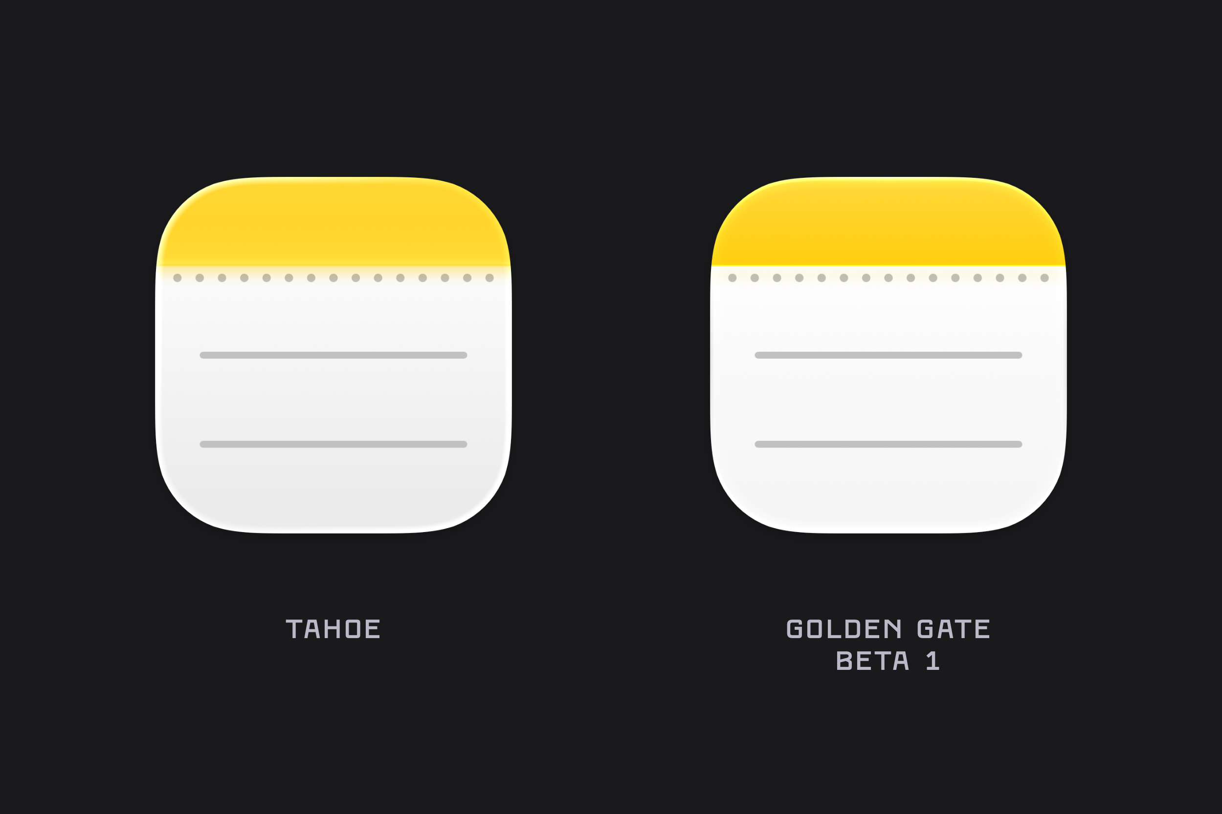
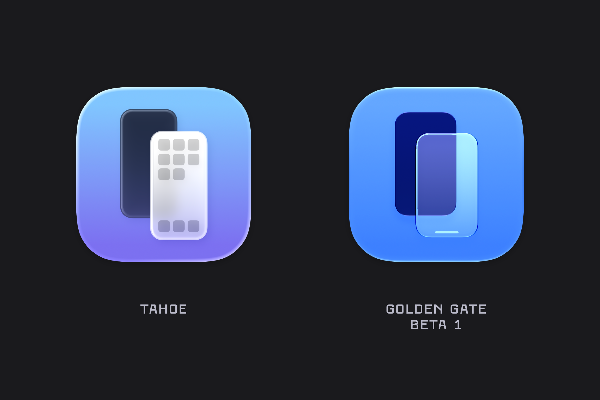
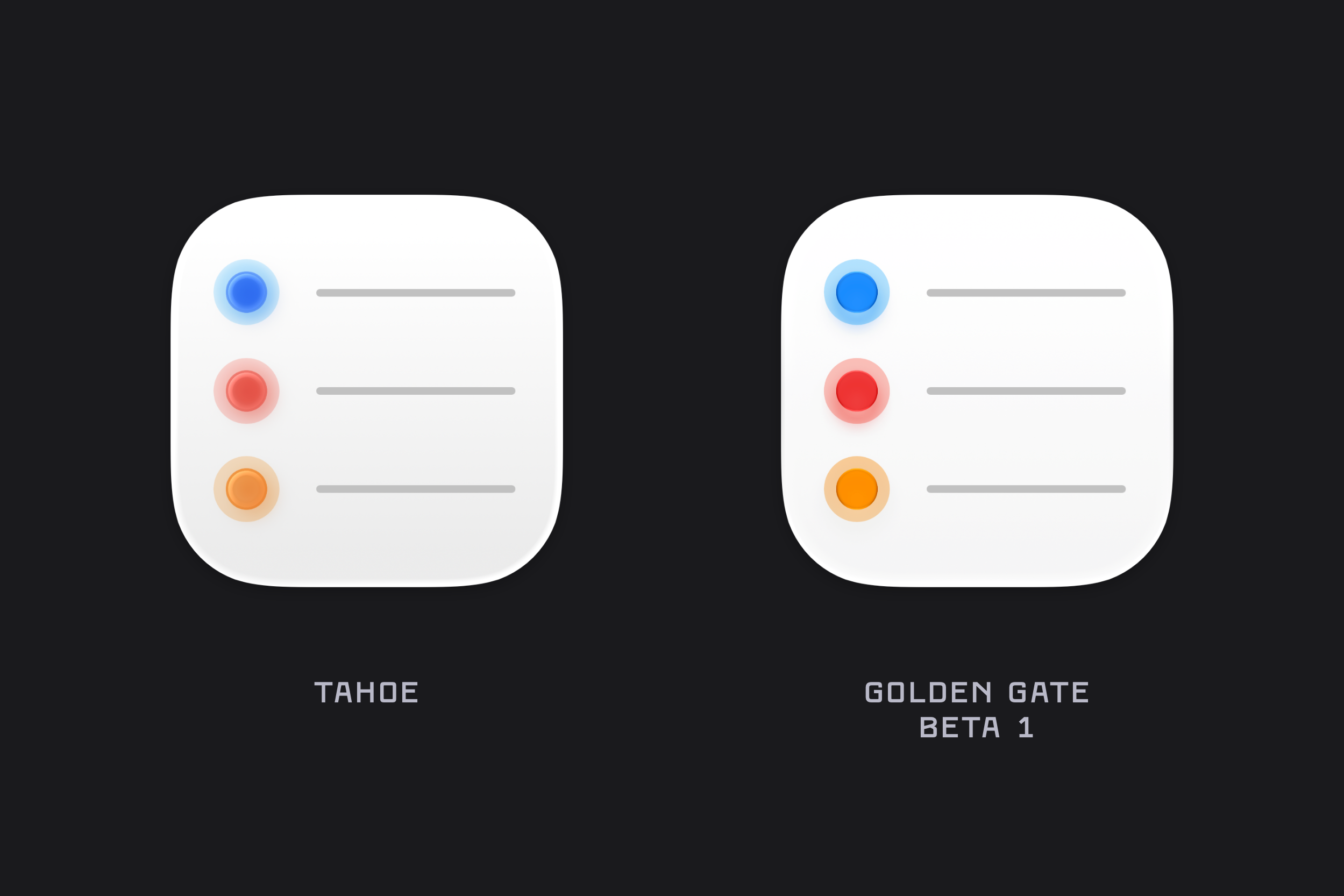
WWDC always brings a torrent of new content, details, and platform-wide changes. One of the first things I noticed after installing the macOS Golden Gate beta was the updated icon design. The colours are much bolder, several icons have been adjusted, and the refraction in the Liquid Glass effect has changed significantly, especially in icons like Journal.
There’s also a noticeable sharpness to the icons, along with a flattening of the Liquid Glass effect. I’m not sure yet whether this is simply an early-beta artifact or the intended final look. For example, while I really like the redesigned Finder icon, the sharp black edges around the nose currently feel a little unrefined.
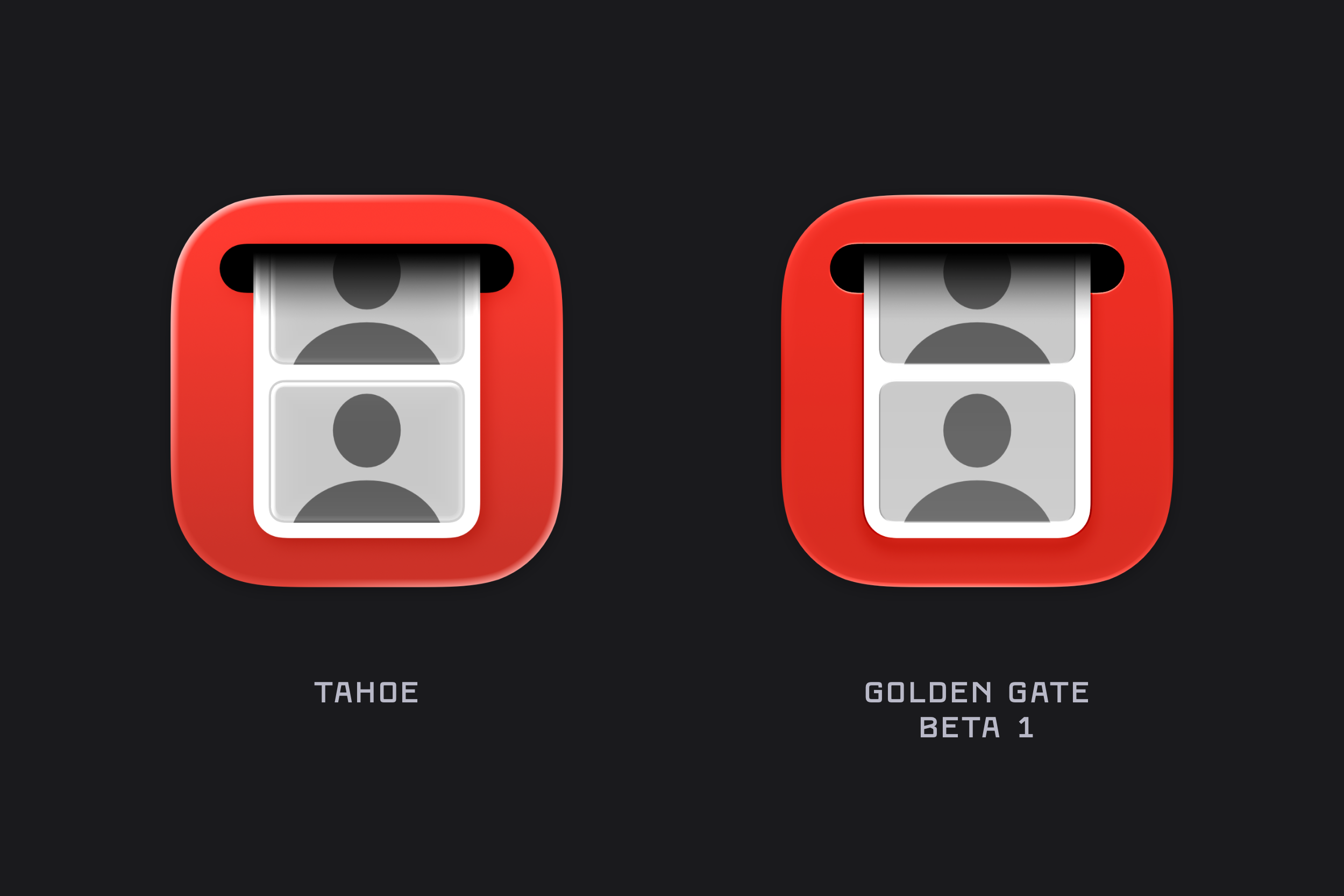
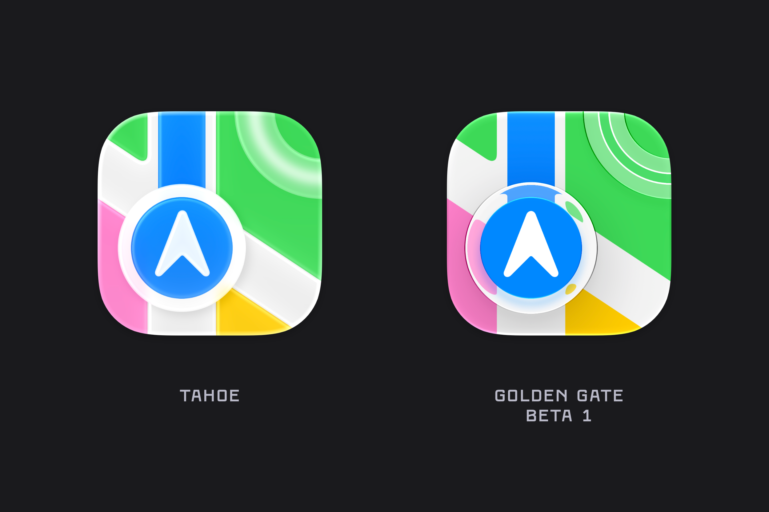
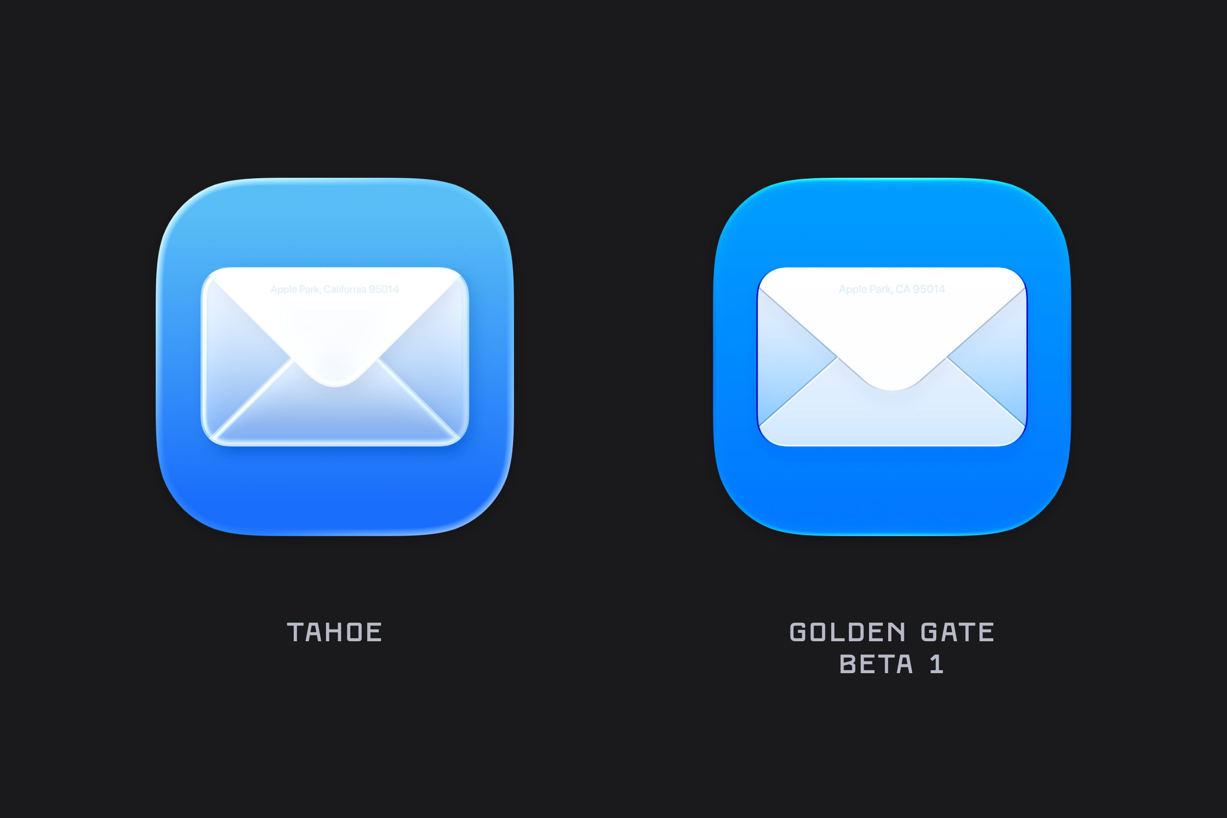
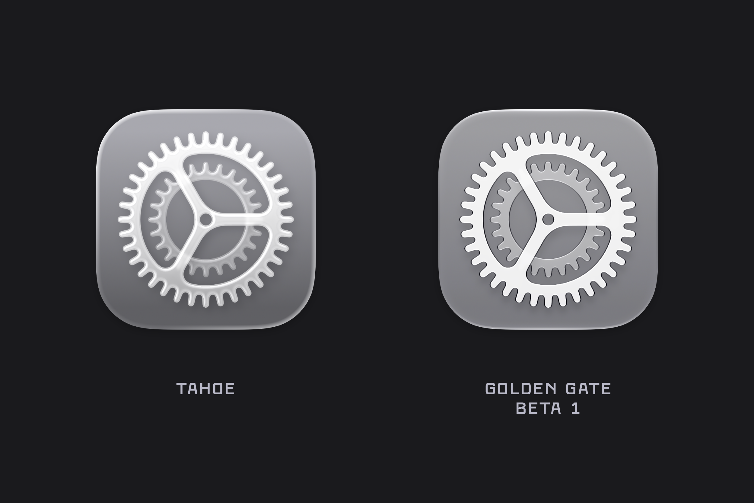
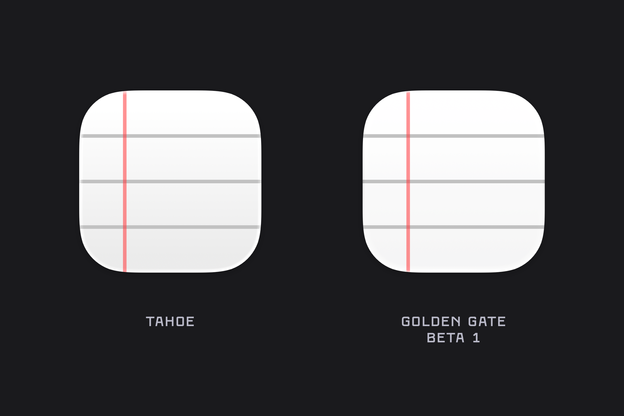
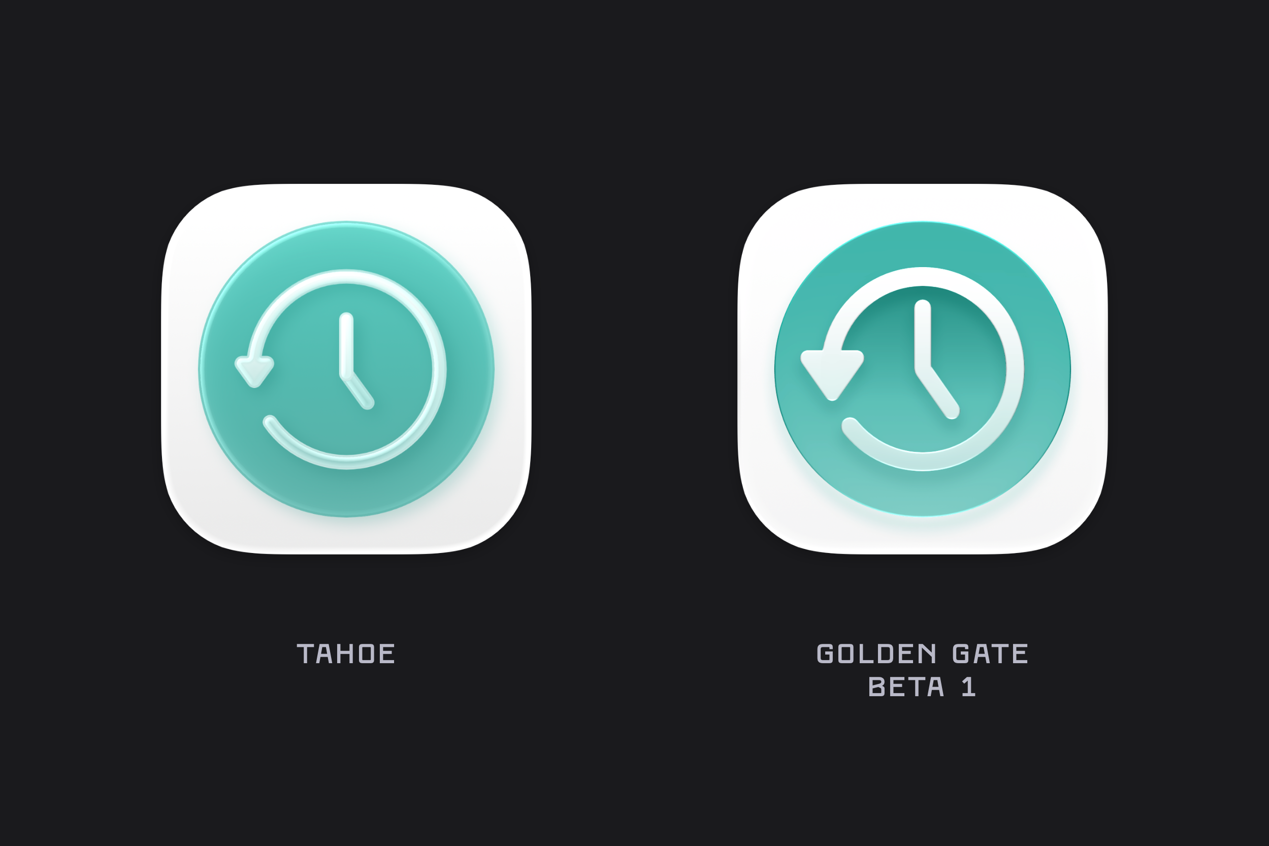
Here are a list of many of the icons across macOS Golden Gate (beta 1) compared to their liquid glass Tahoe counterpart. Enjoy!
Finder
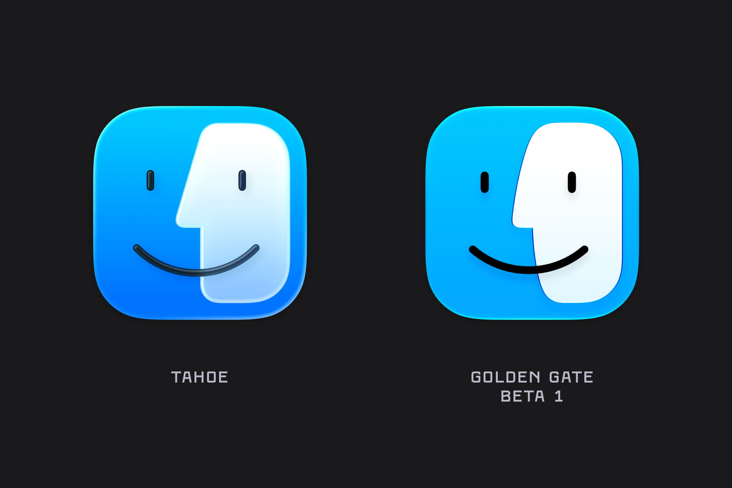
Finder has undergone a bit of rhinoplasty over the past year, returning to the more rounded nose that recalls earlier iterations of the icon.
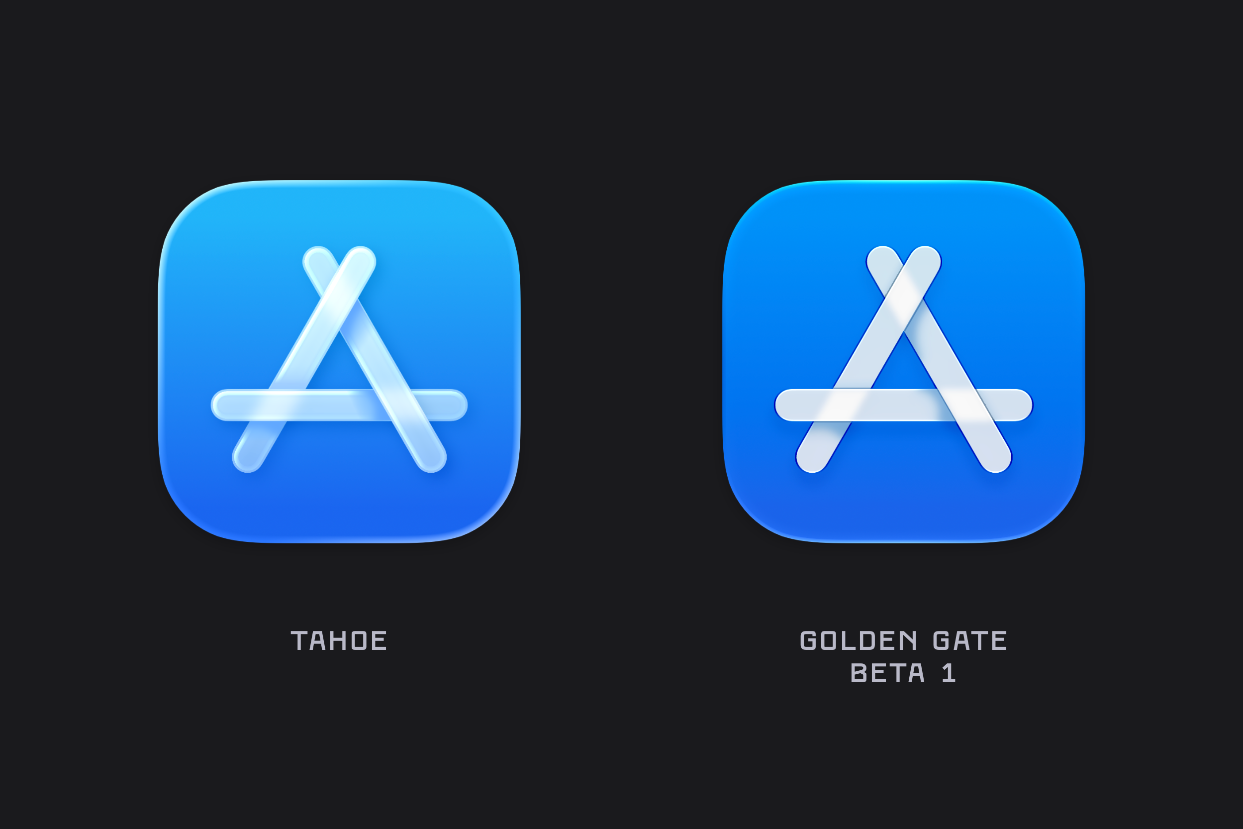
App Store
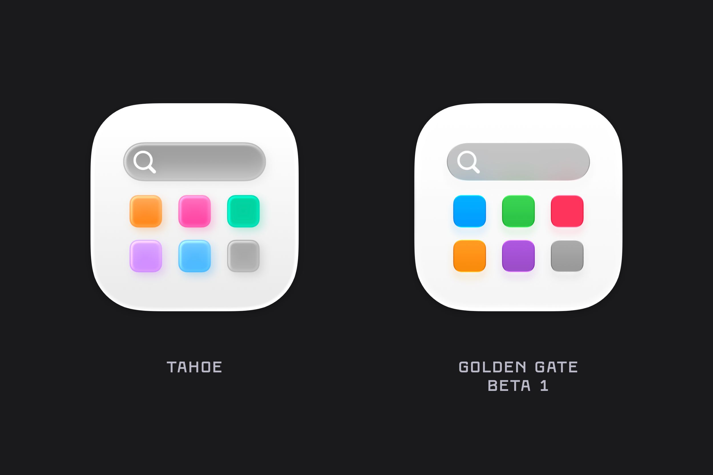
Apps
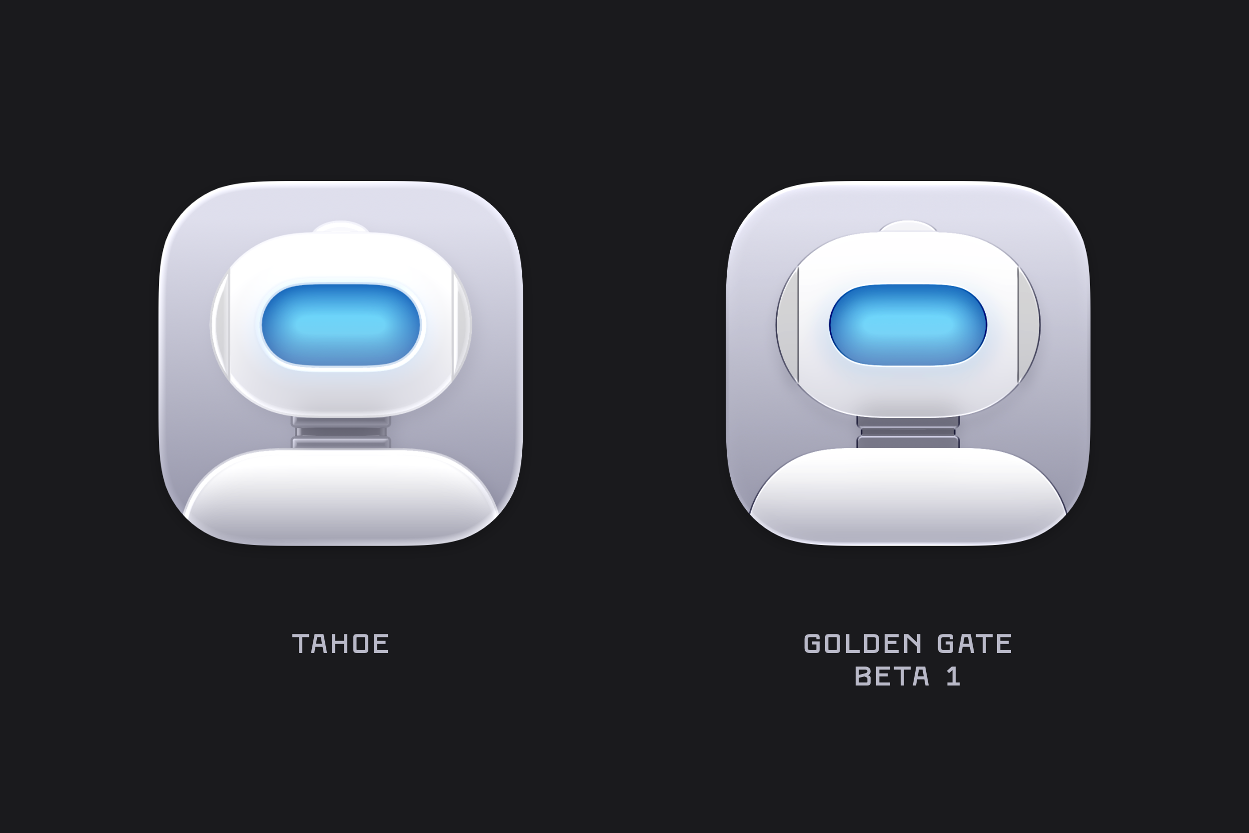
Automator
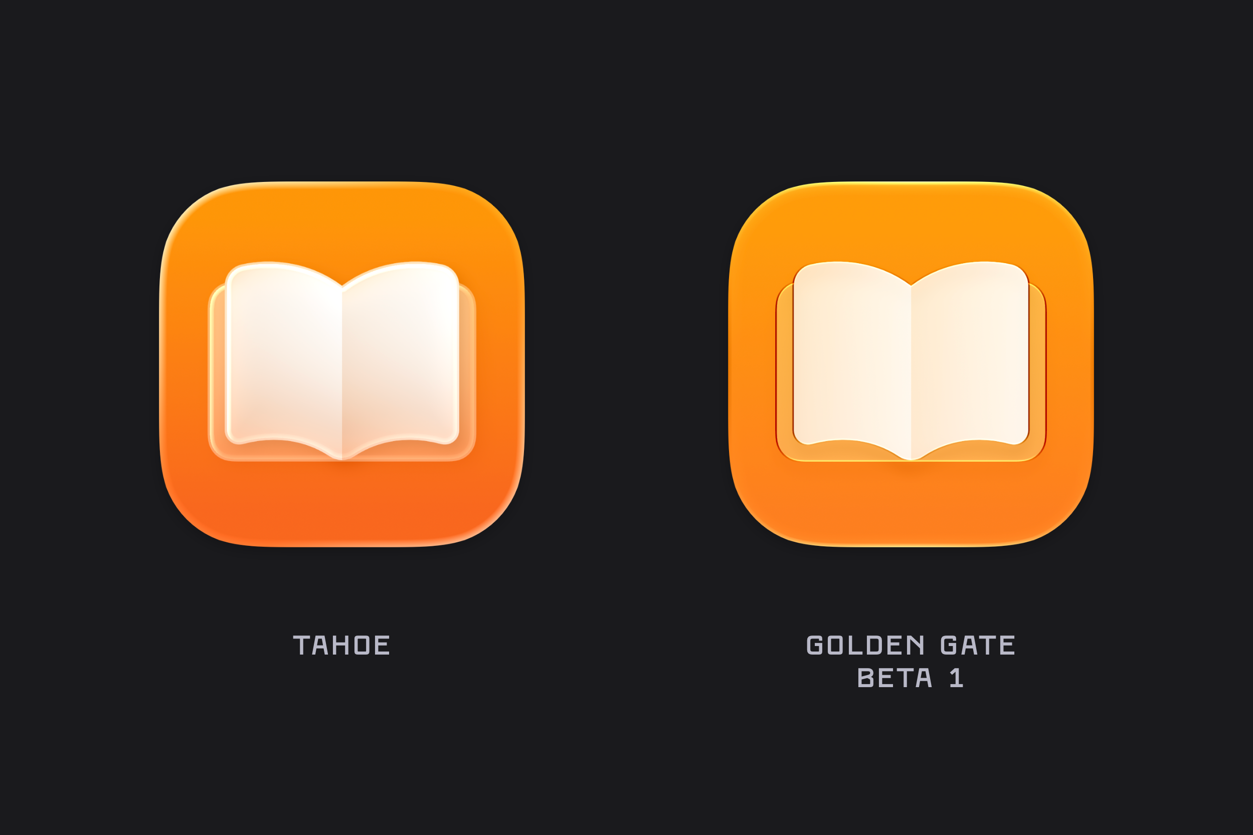
Books
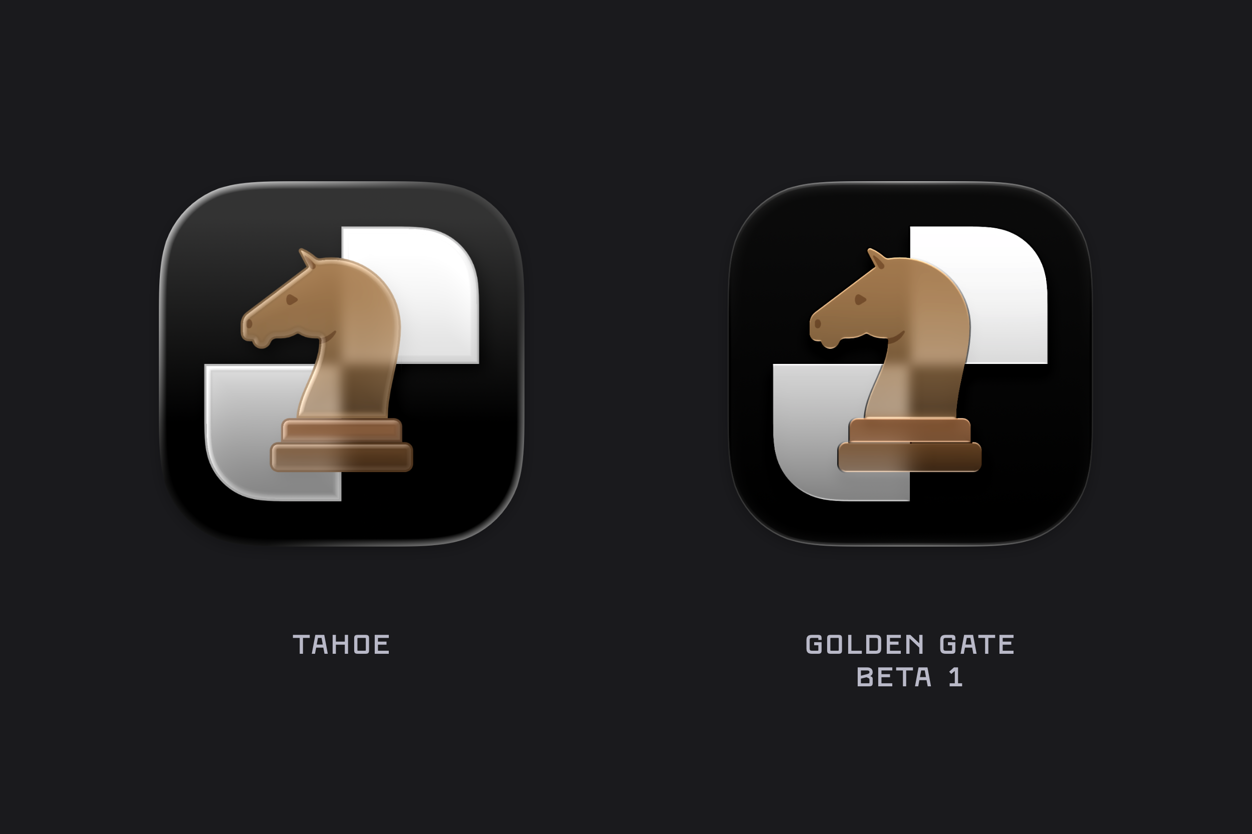
Chess
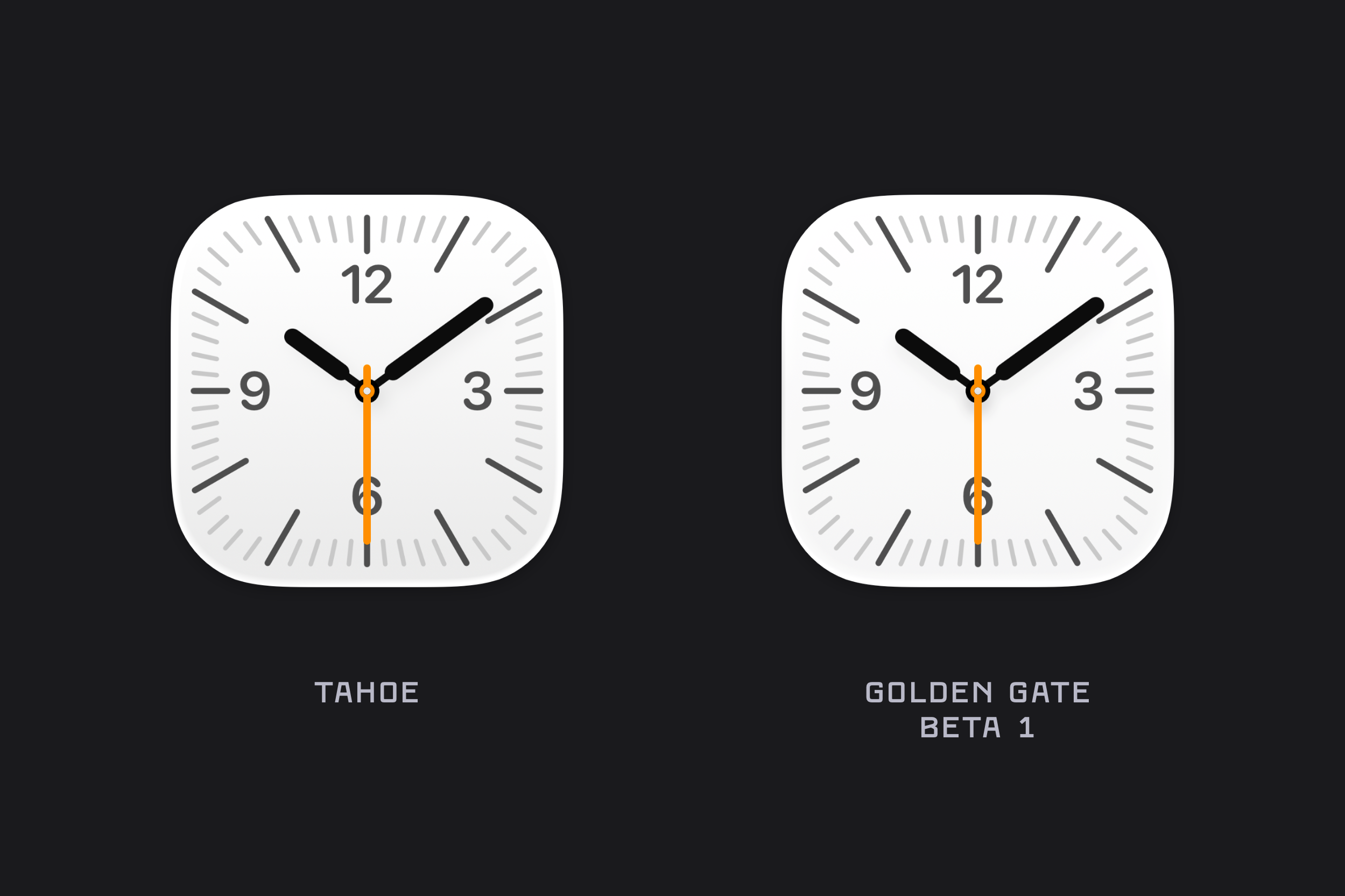
Clock
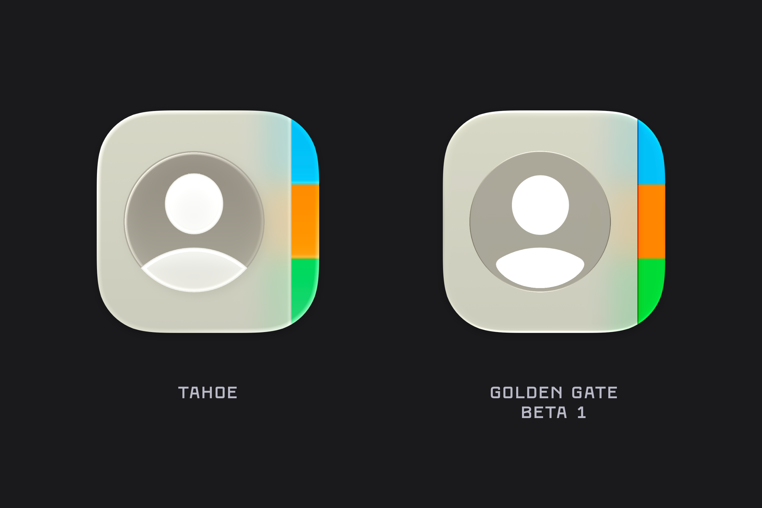
Contacts
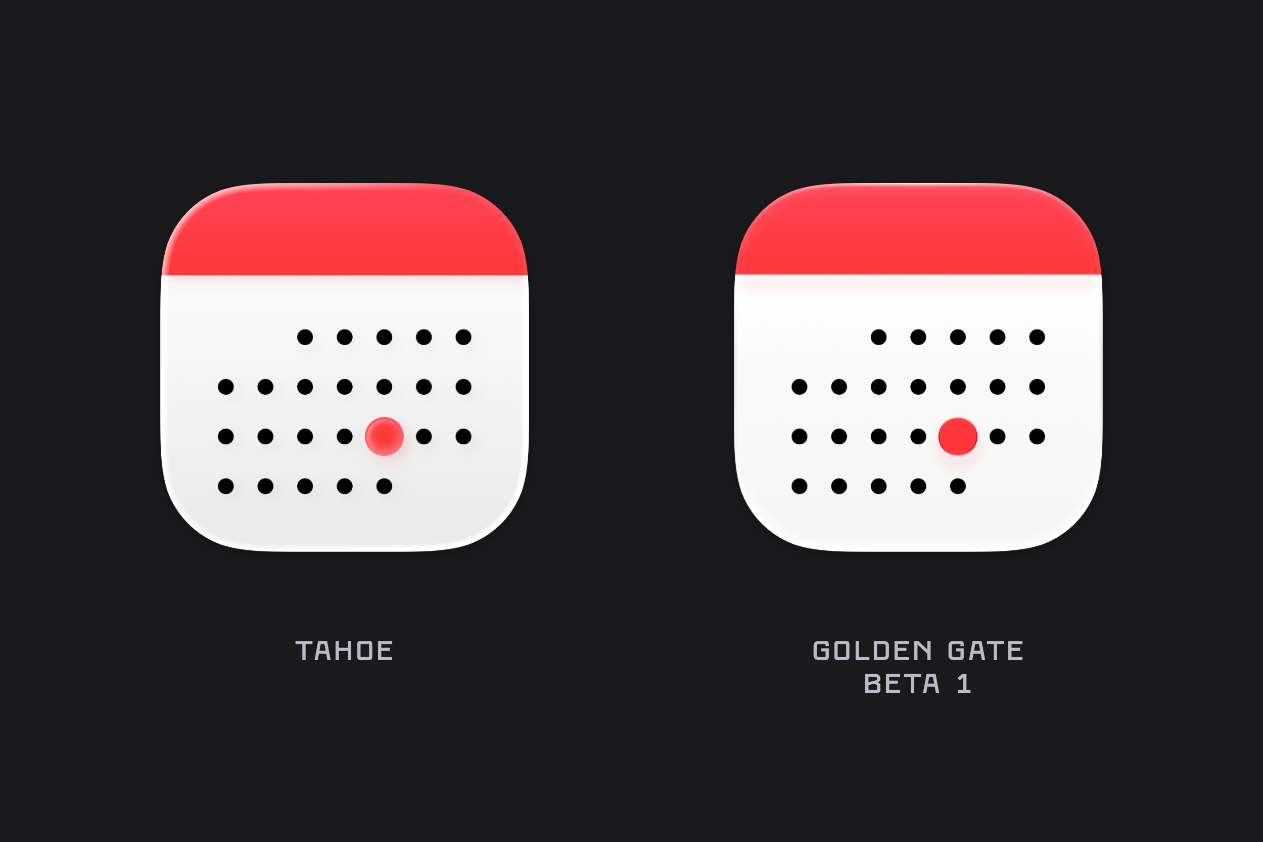
Calendar
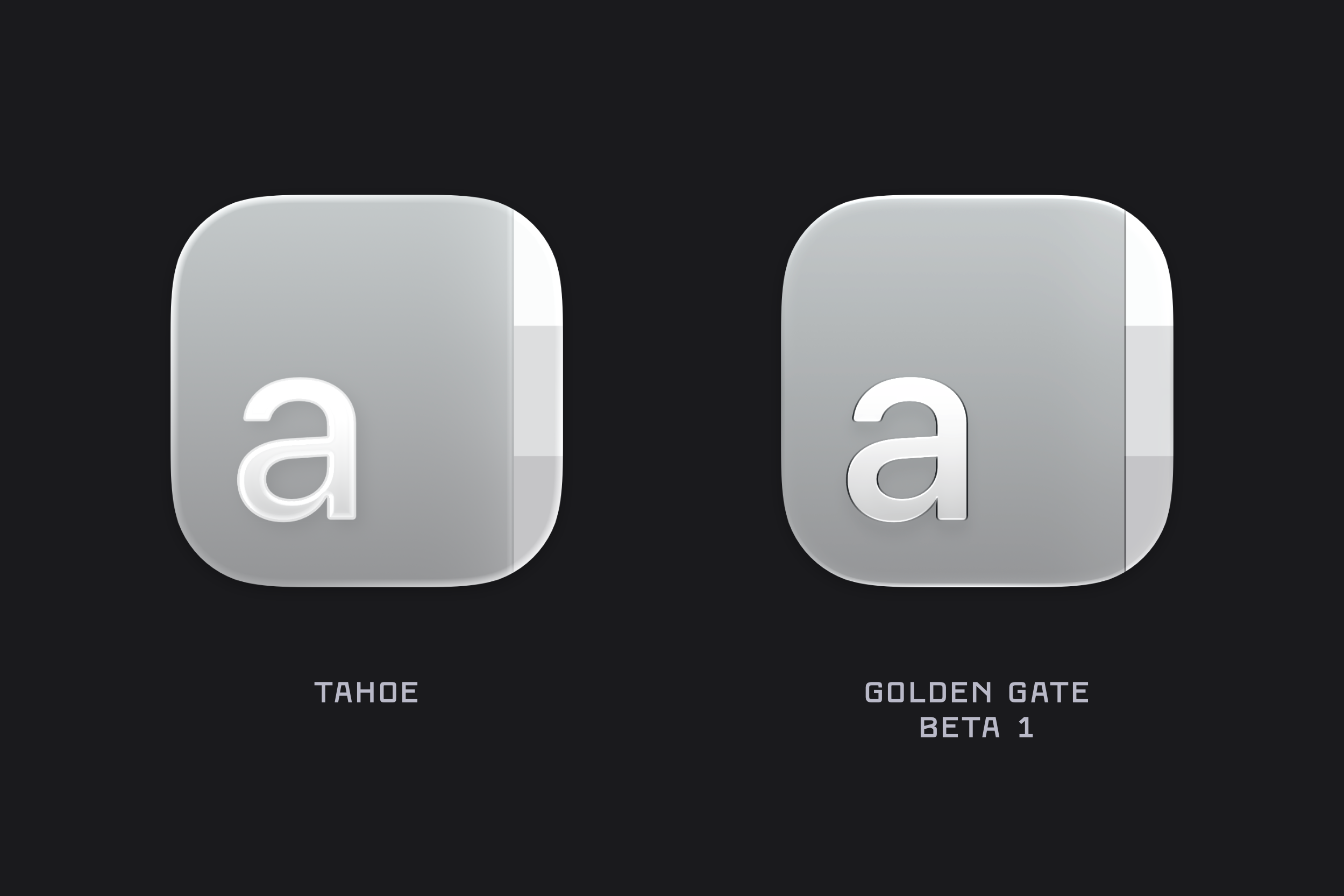
Dictionary
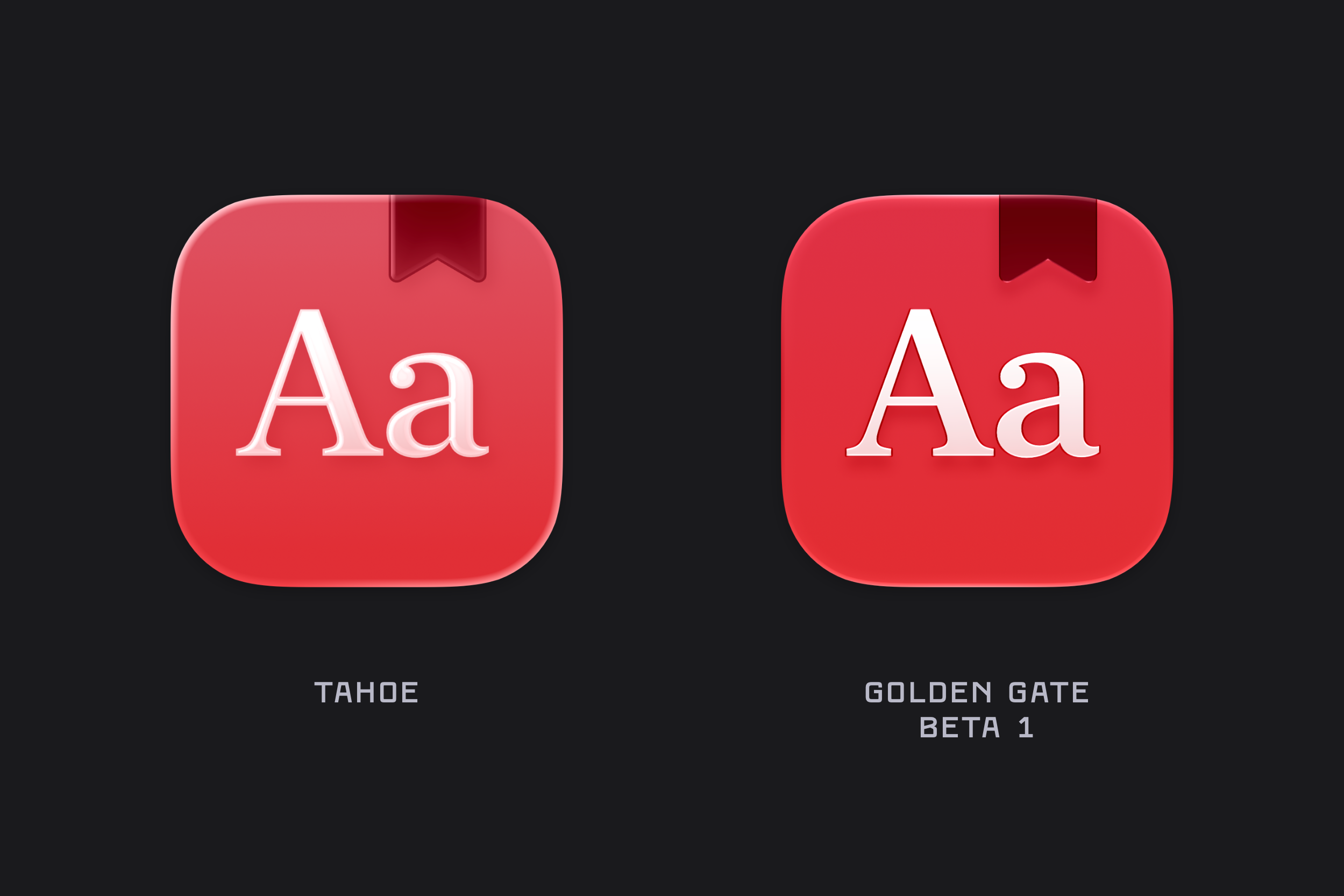
Font Book
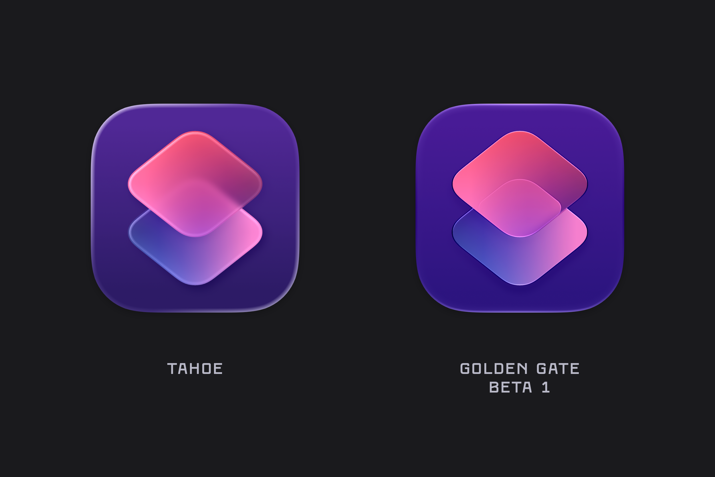
Freeform
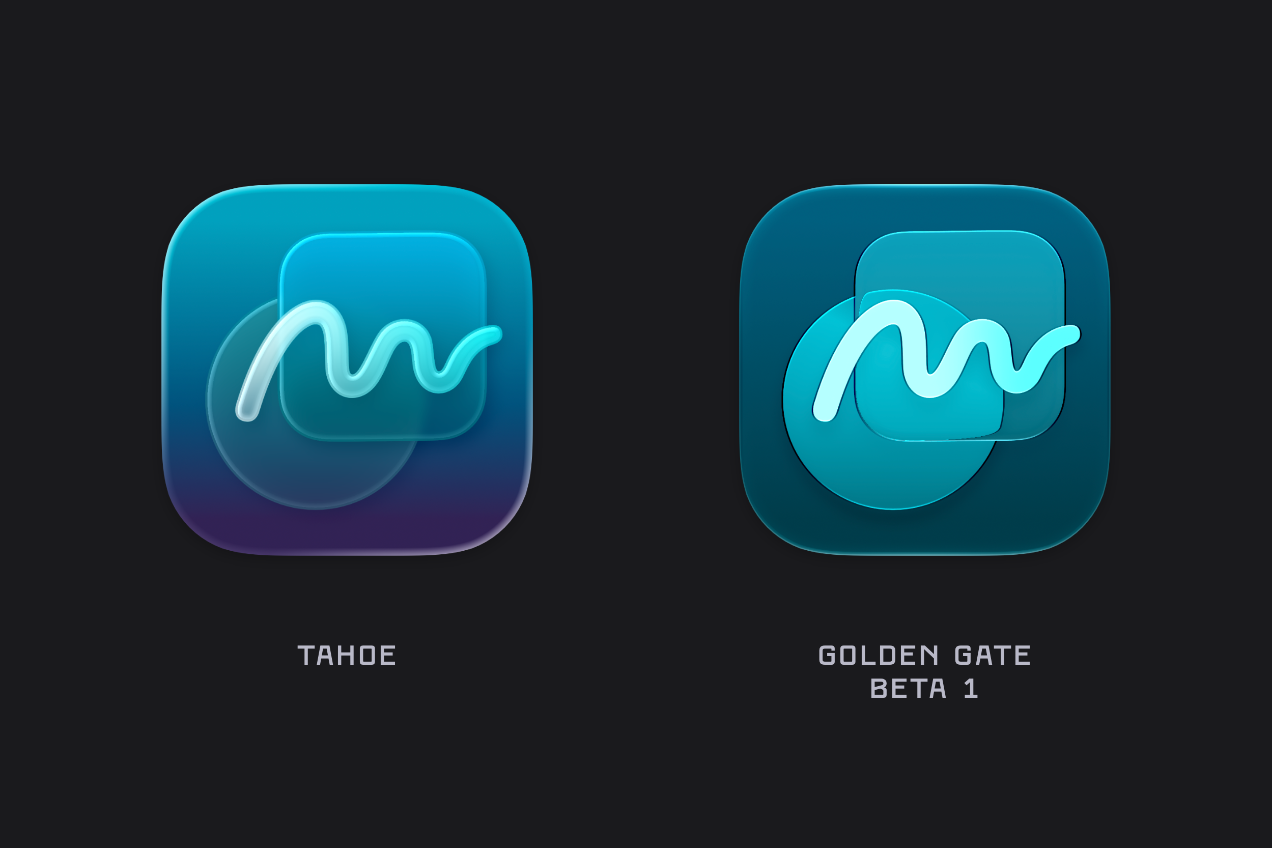
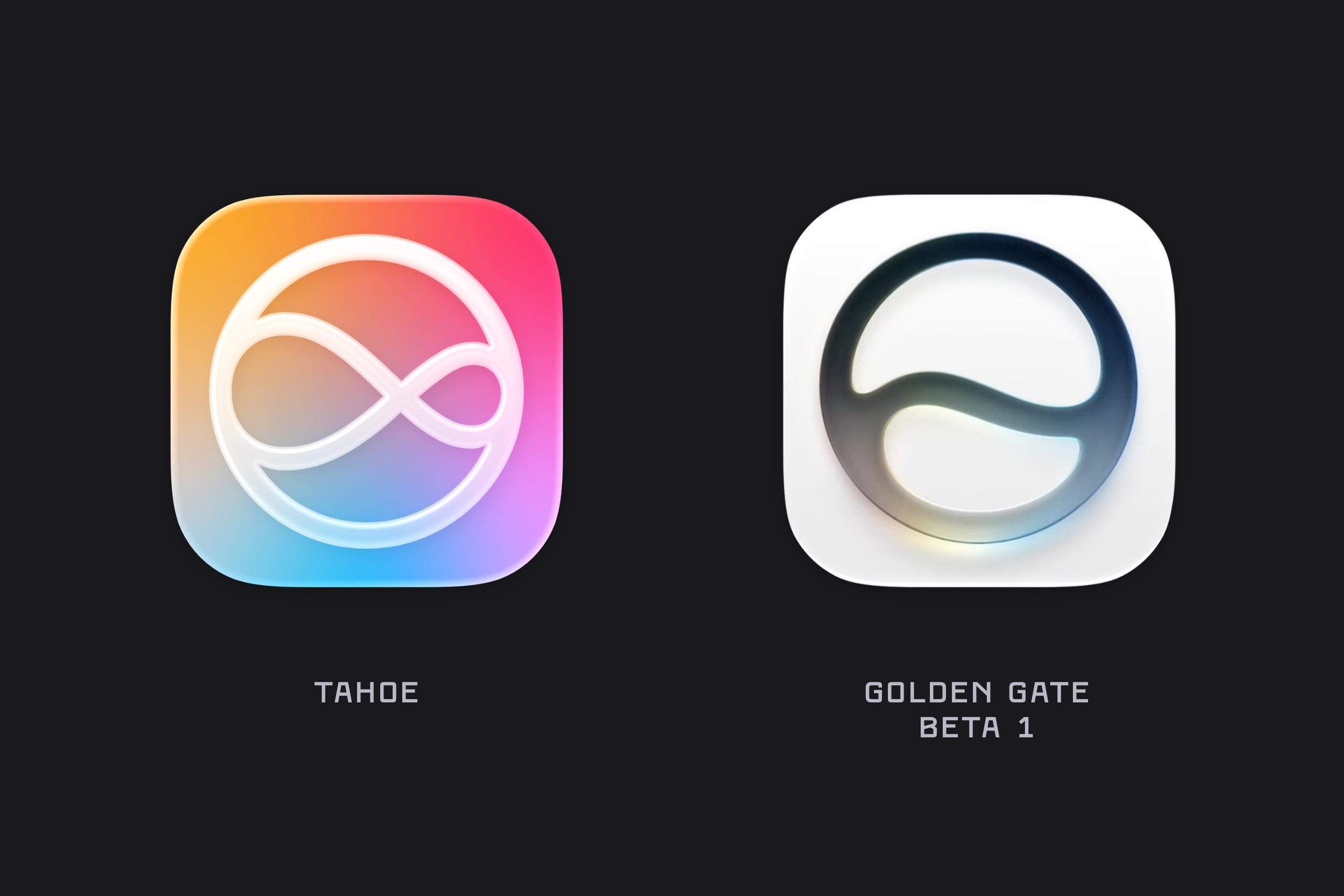
Updated colours, and the refractive properties of the Golden Gate icons are especially noticeable when you compare how the circle distorts as it approaches the edges of the rounded rectangle layered over it.
Games
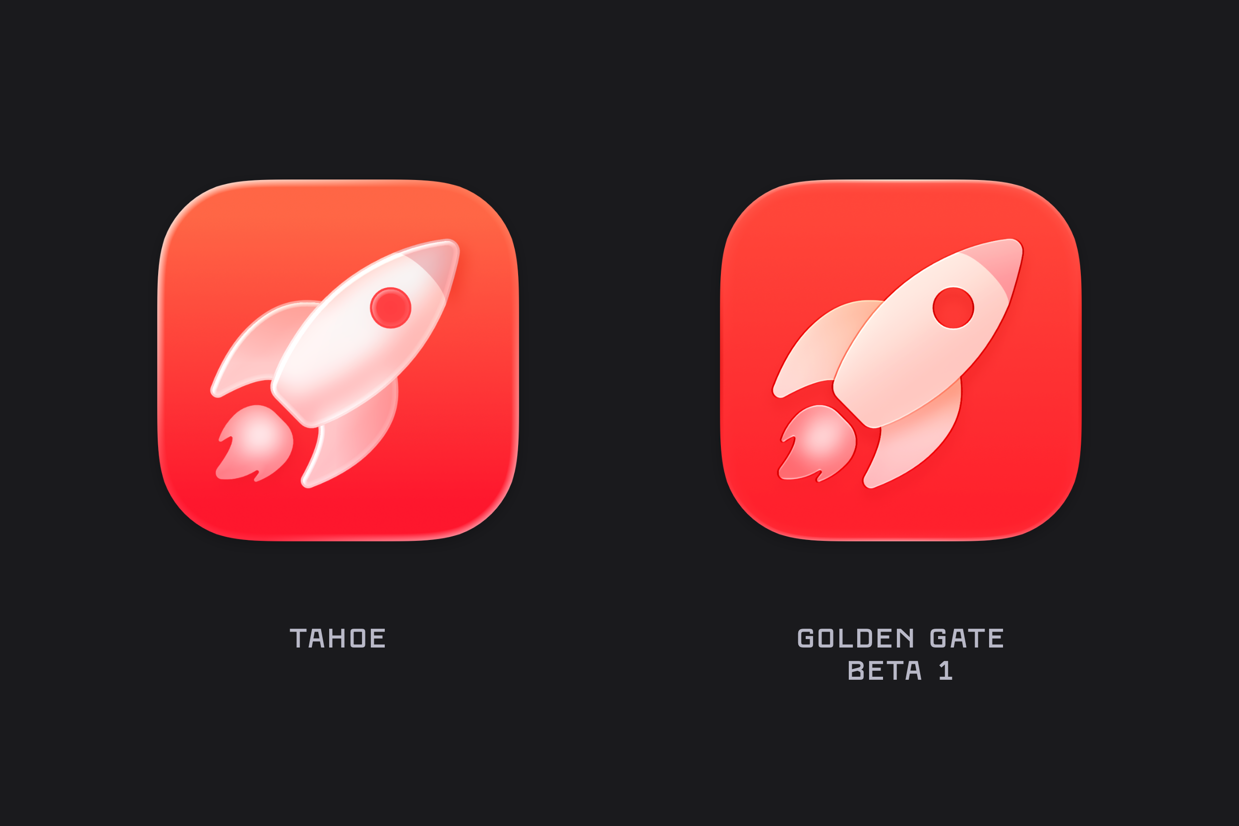
Home
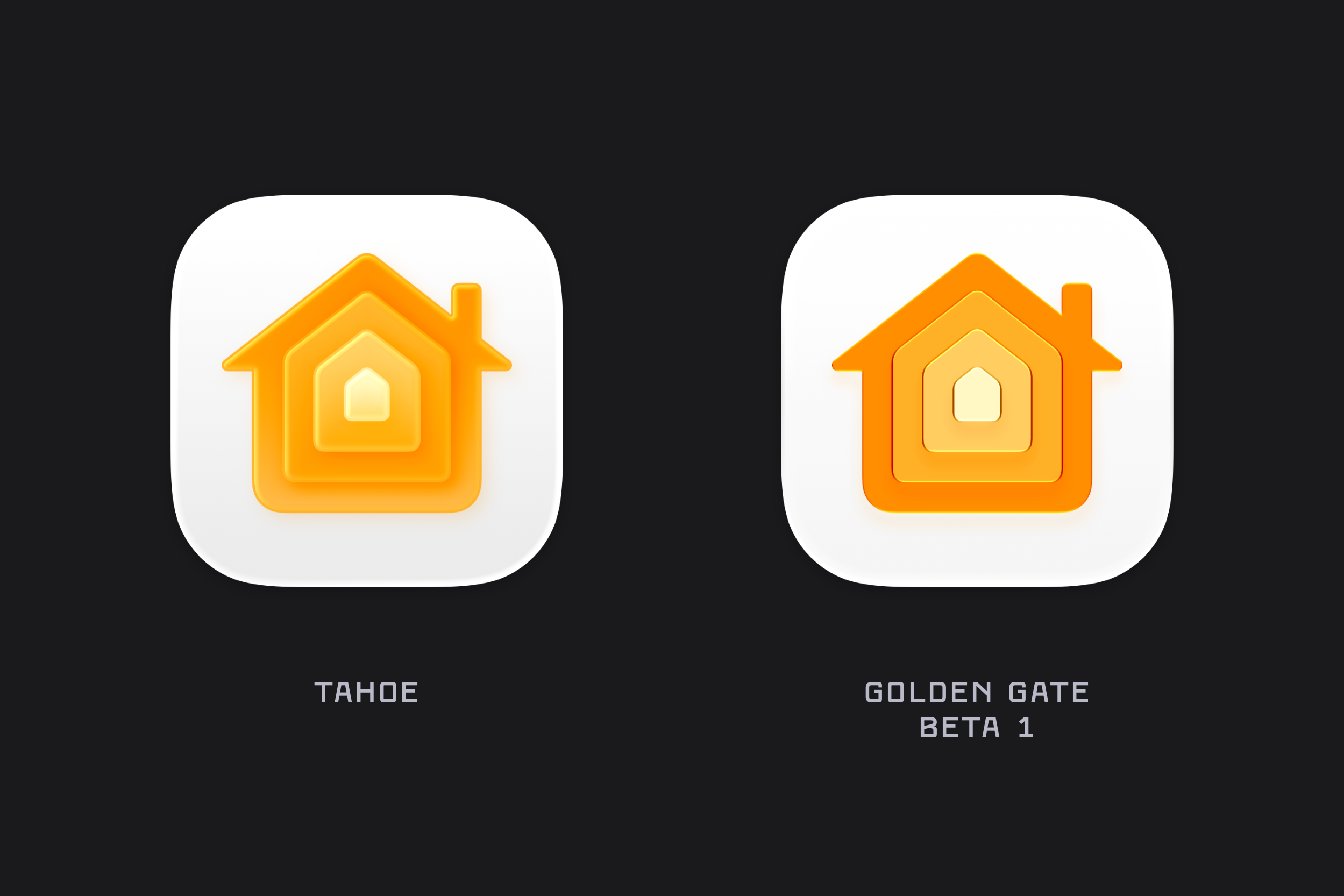
Image Playgrounds
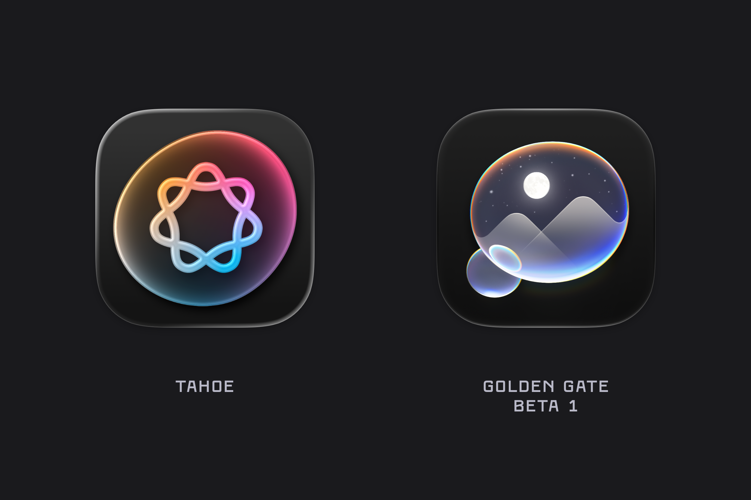
Journal
Journal is another example where we can see the updated refraction brought to macOS icons.